Jerry Saltz’s retrospective pays homage to nearly six decades at the School of Visual Arts
Jerry Saltz probably has a lot of apologies to make. Not even the 101 artists he is currently showcasing can adequately represent all those who have passed through the doors of the School of Visual Arts—and represent the school’s overall impact.
And even at that, half a page will be nowhere near enough to cover the volume of work in Saltz’s curatorial effort, which spans recent work by artists who attended SVA mostly during the past 25 years. Due to Saltz’s strength as a curator, there’s not a weak work in the lot—and, almost lamentably, not even a jarring moment.
While many art schools have a style of their own, SVA, now located only a few blocks from Chelsea and the center of the New York art world, has allowed its students to be fed as much by the time they were living through as by a dogmatic aesthetic. A late 70s and early 80s graffiti style is represented by artists such as Tim Rollins and Keith Haring (posthumously awarded his MFA in 2000) and an East Village aesthetic is engendered by a burly 1979 work by Kenny Scharf, “Hydrogen is God” (acrylic on a found object).
Still, the illustrative/trade school nature of SVA is readily discernable in the prurient ink-on-paper renderings of Yuko Shimizu and the architectural distortions of Robert Lazzarini’s sketched objects. Barnaby Furnas, with his space age watercolors—part abstraction, part early 20th century illustration—also points to that mission, as does Doug Wada and his trompe l’oeil fire hydrant and orange cone. Even Sol LeWitt—whose 1953 study of illustration at SVA predates the other 100 artists in the show—speaks, with his on-site editions and a mode of installation that transcends the artist’s participation, to an industrial world where art is manufactured.
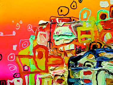
The exhibition’s sculptural inclusion is light. Saltz’s choices underscore the way in which photography, digital media, film and painting show a pop alacrity through under-drawing. Wolfgang Staehle’s “Berlin Pan” demonstrates a high degree of mental draftsmanship in an apparently candid, mechanically mediated DVD cityscape. Frank Holliday’s acrylic-oil-marker-on-canvas “Barcelona” is a tough, effortless mandate of color as color and composition as composition. The lack of analogs (for example, red=angst, splattered paint=freedom) has allowed for the recent explosion of the painted surface. Not too long ago a discussion of illustration and abstraction would have been almost impossible; today that discussion is an assumption of a larger integration of pop, abstraction and figuration.
A strong curatorial presence provides “Beginnings” with the bold scope of a museum retrospective. It is well worth noting that SVA is creeping up on its 60th anniversary.